
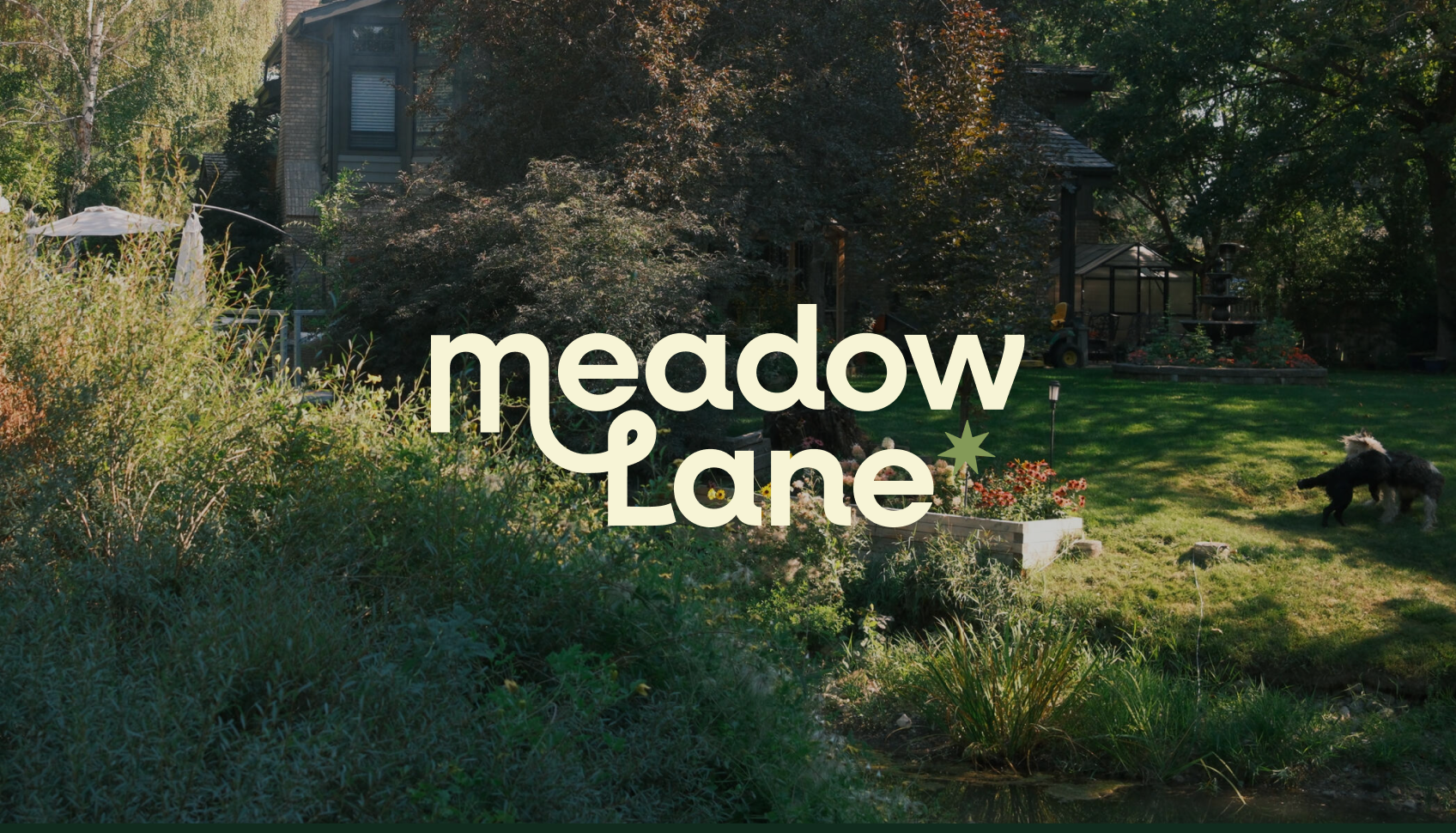
CASE STUDY · BRAND IDENTITY AND PACKAGINGMeadow Lane
Illustrated mahjong sets. The first began in my grandparents’ backyard.
Most new mahjong sets arrive as seasonal drops: a pattern, a colorway, on to the next. Meadow Lane needed to feel like a place instead, a street where each set is its own house with its own world.
ROLEFounder and sole designer
STATUSLaunching April 2027
SCOPEBrand strategy
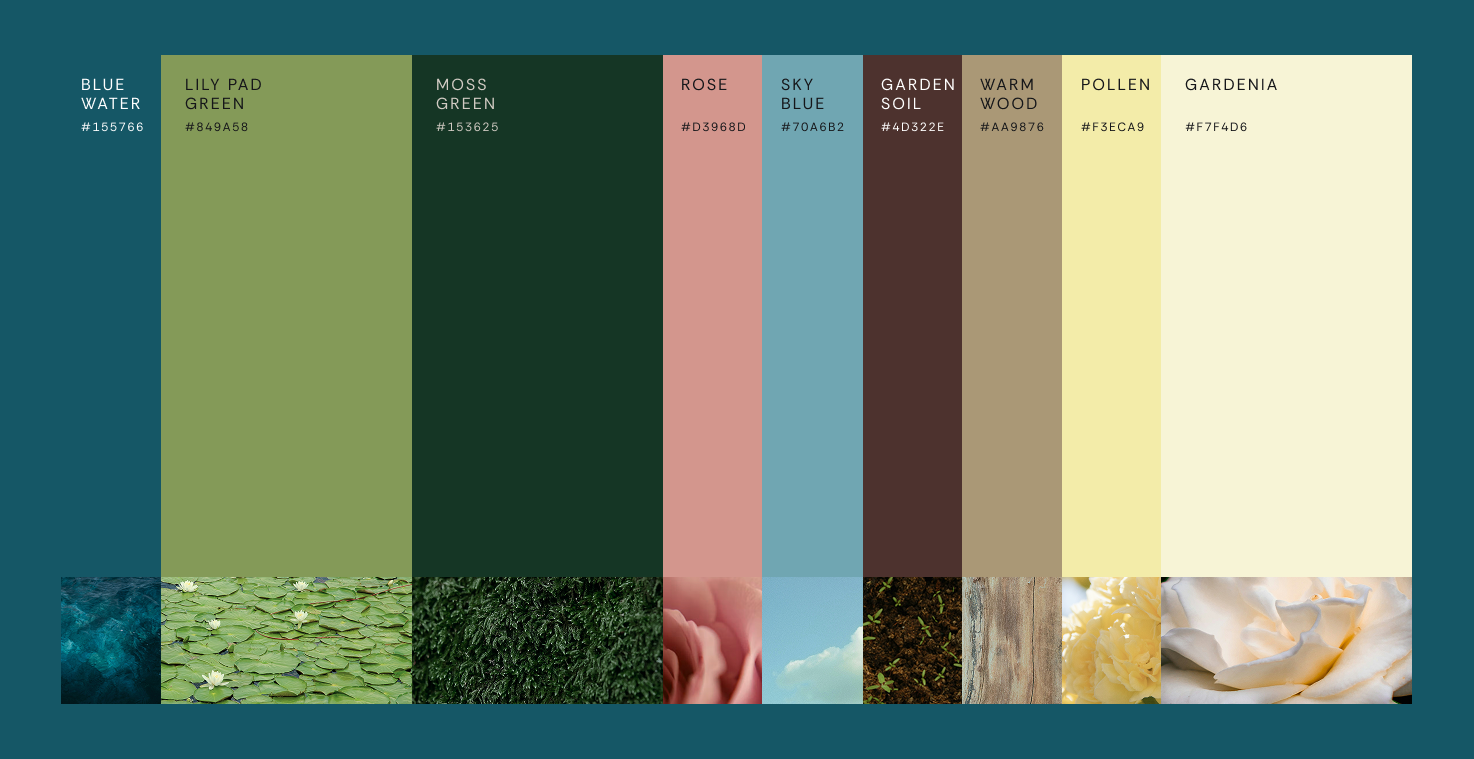
Logo and visual identity
Packaging
Brand guidelines and voice
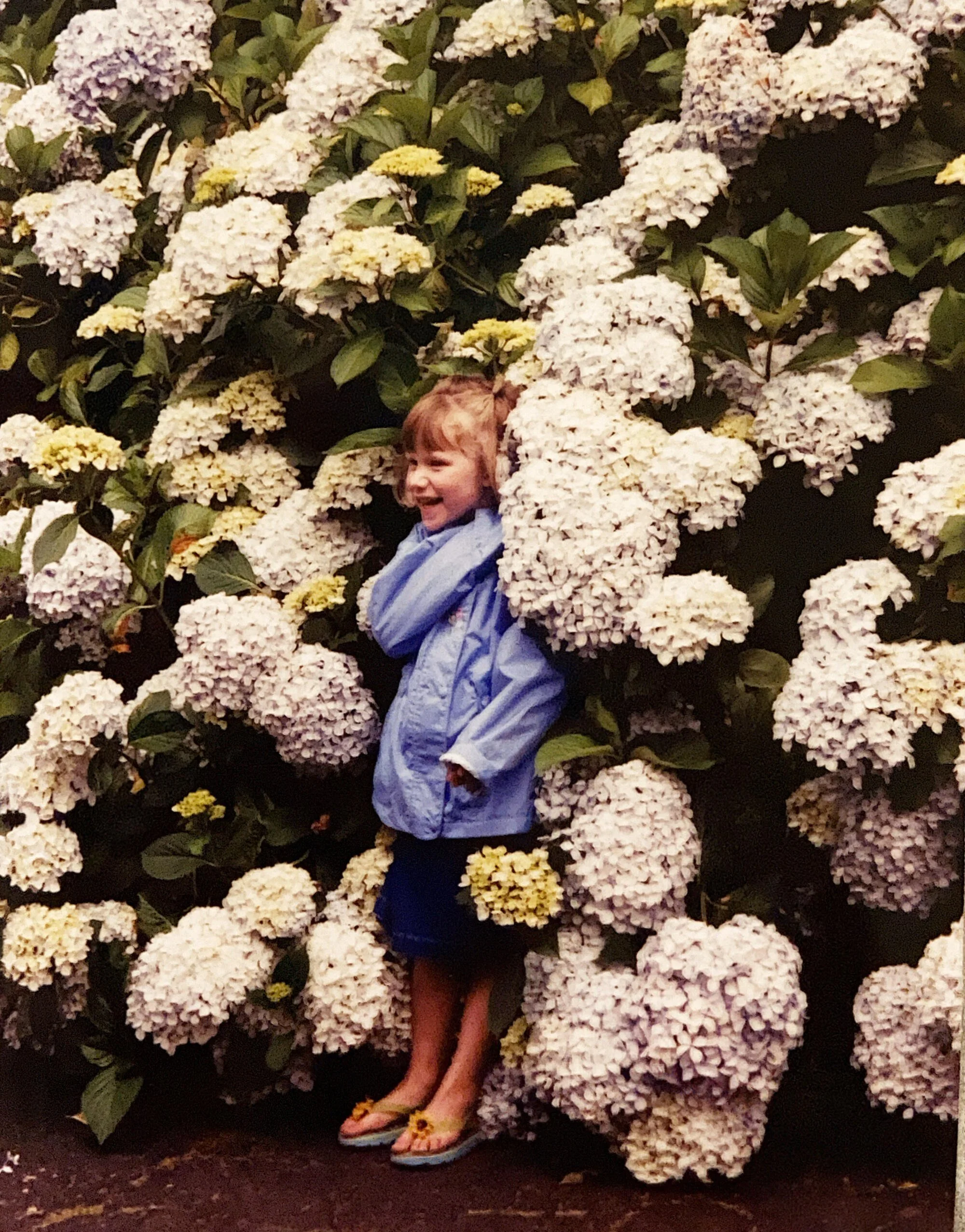
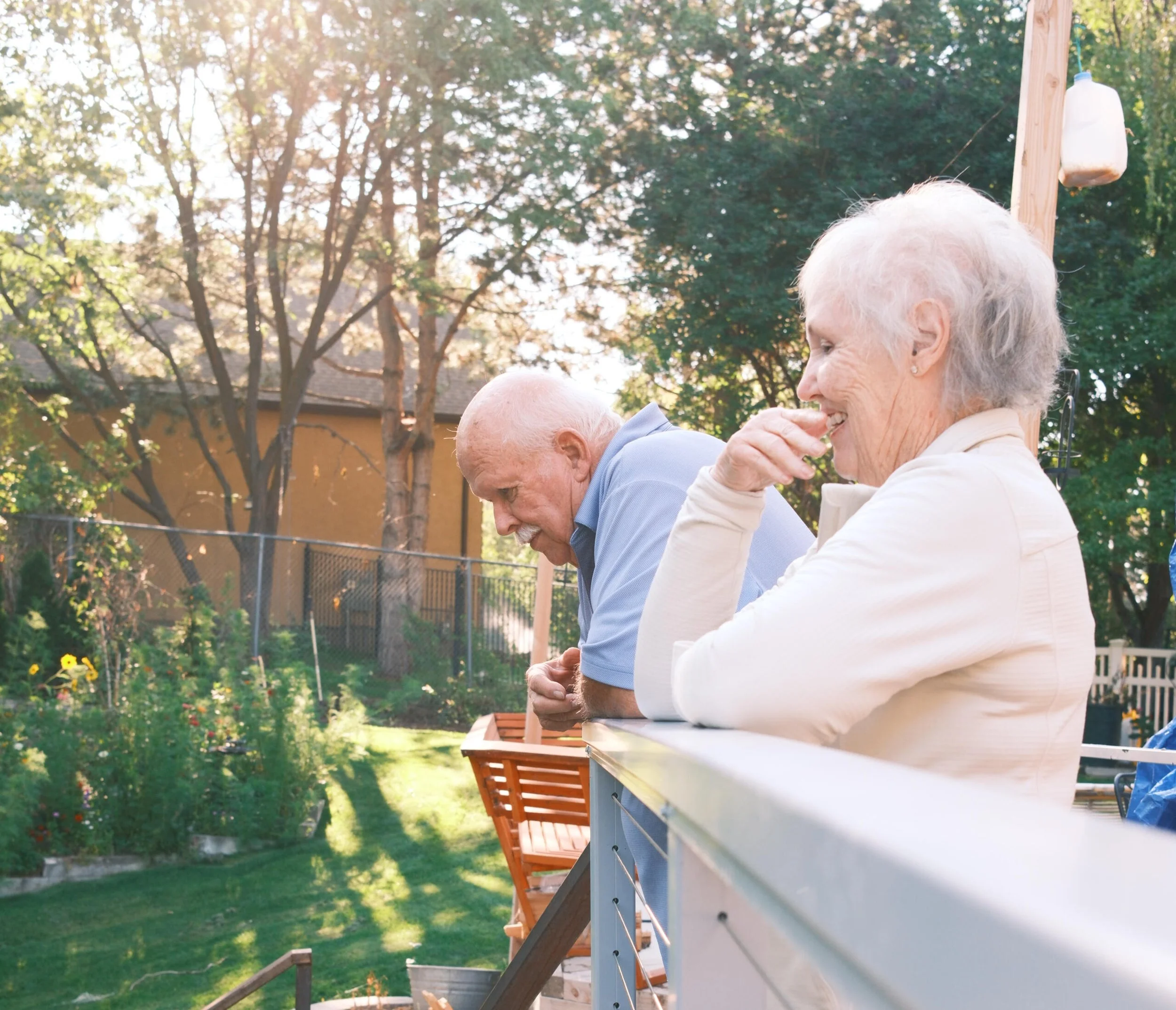




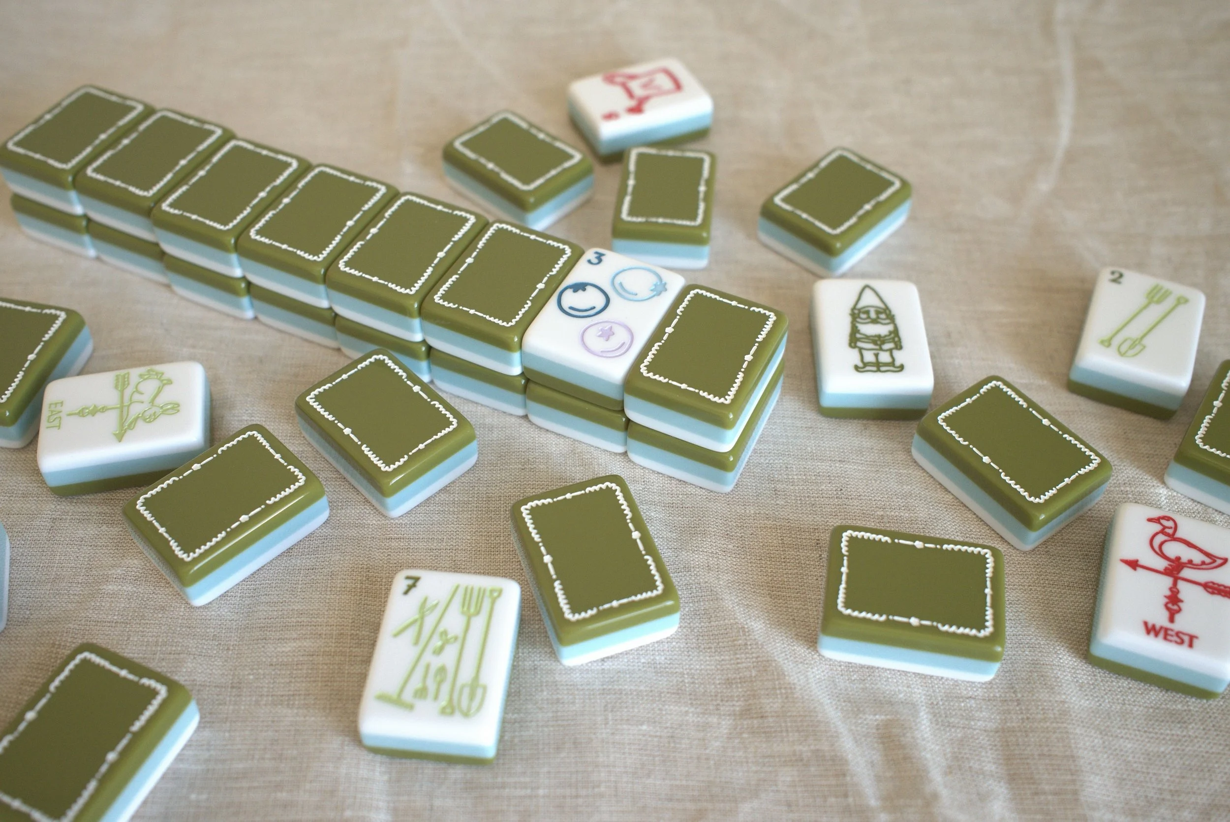
"Meadow Lane, where the garden was always in bloom and no one was even in a hurry to leave."
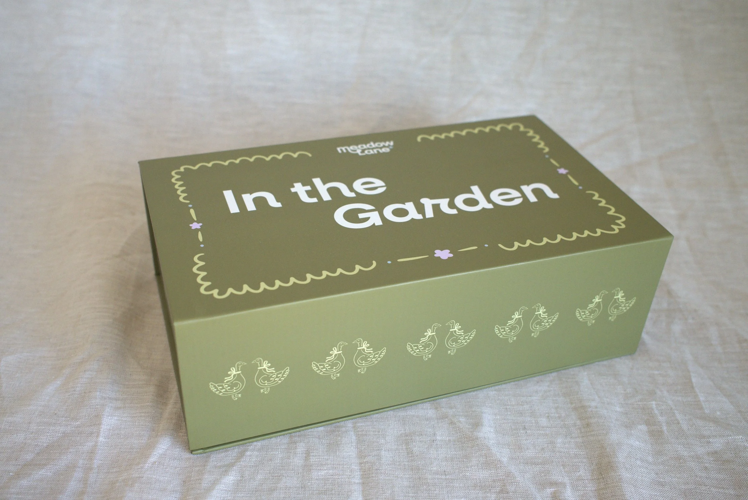
Packaging and illustration for product
THE BRIEFTiles worth a closer look, every time you play
Meadow Lane is for players and gift-givers who want more than pretty. The brand had to do three things.
Give every set its own world. Each collection is a house on the same street, so every one needed room to be different without losing the family resemblance.
Speak to two buyers. The player setting the table and the person choosing a gift should both find a set that feels like theirs, or like someone they love.
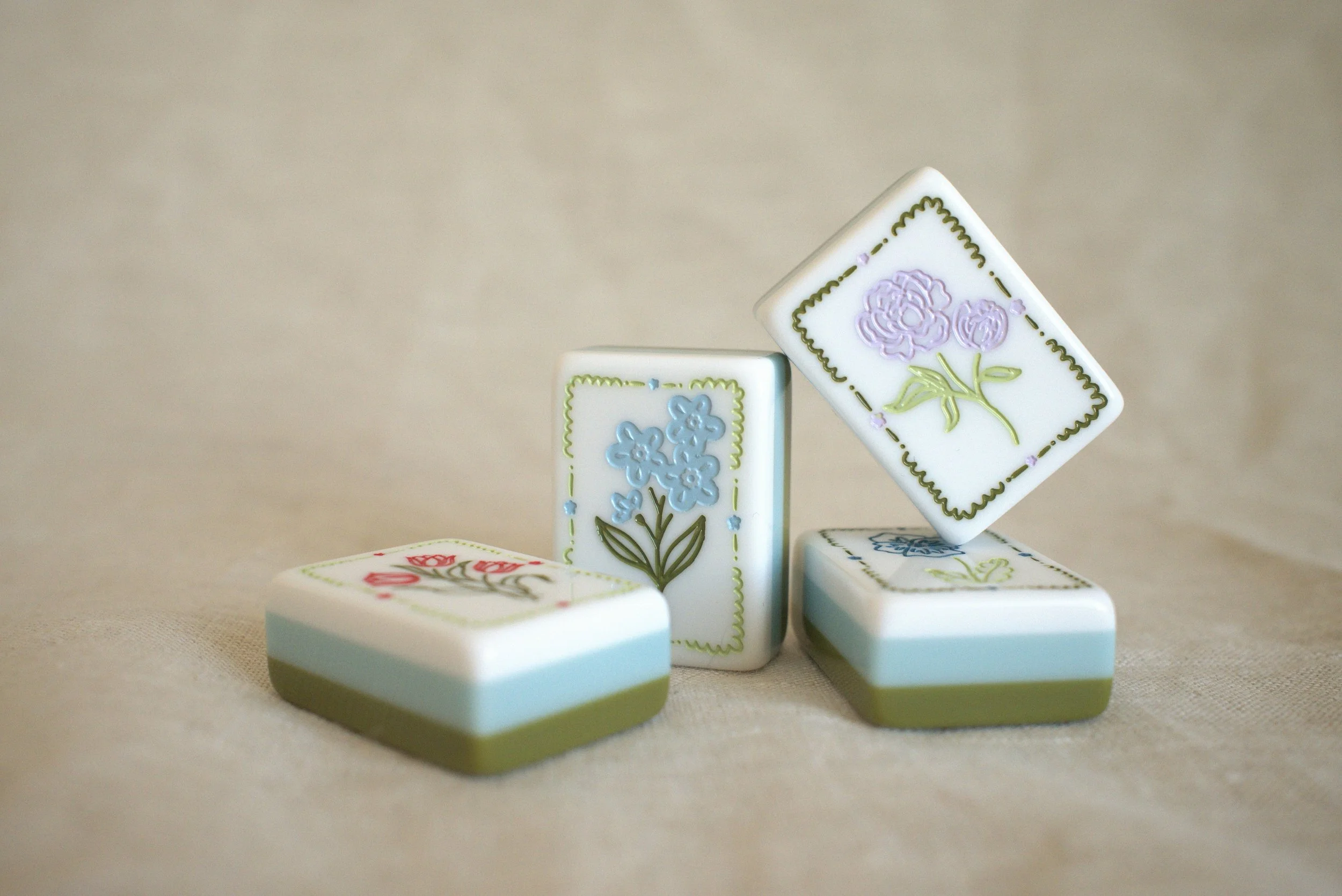
Hold up on a second look. From the box to the last tile, the details had to reward anyone who looked closer.
THE IDEAThe neighborhood
One world
Every tile in a set belongs to the same place.
Real stories
Sets start with real people and places.
Beauty up close
Drawn and finished by hand, with small surprises.
Made to share
Built for the player and the gift-giver.
THE VOICESpecific beats charming
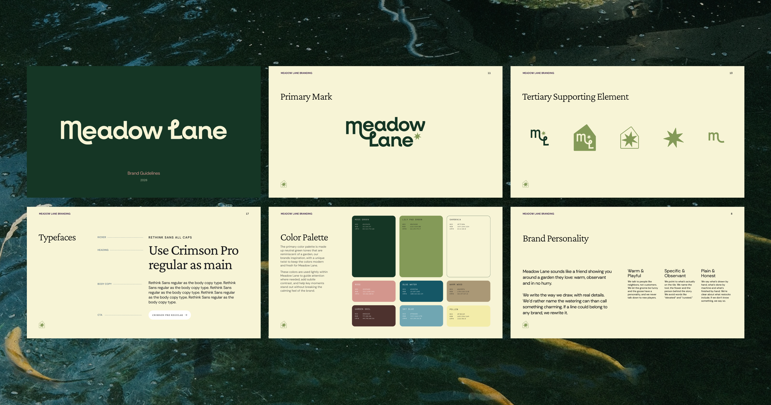
Meadow Lane sounds like a friend showing you around a garden they love: warm, observant and in no hurry. We point at what’s actually there, say plainly what you’re getting, and rewrite any line that could belong to another brand.
What this means for your brand
Meadow Lane started with one real place and a few clear rules. That’s how I approach any brand: find the specific, true thing customers will care about, then build the look, packaging and voice around it.
You get a brand that’s recognizable from the shelf to the screen, and a system your team can keep using after I hand off the files.
Launching something new, or outgrown your first look? Let’s talk.
WORK WITH ME